User interface
What is the structure of the user interface?
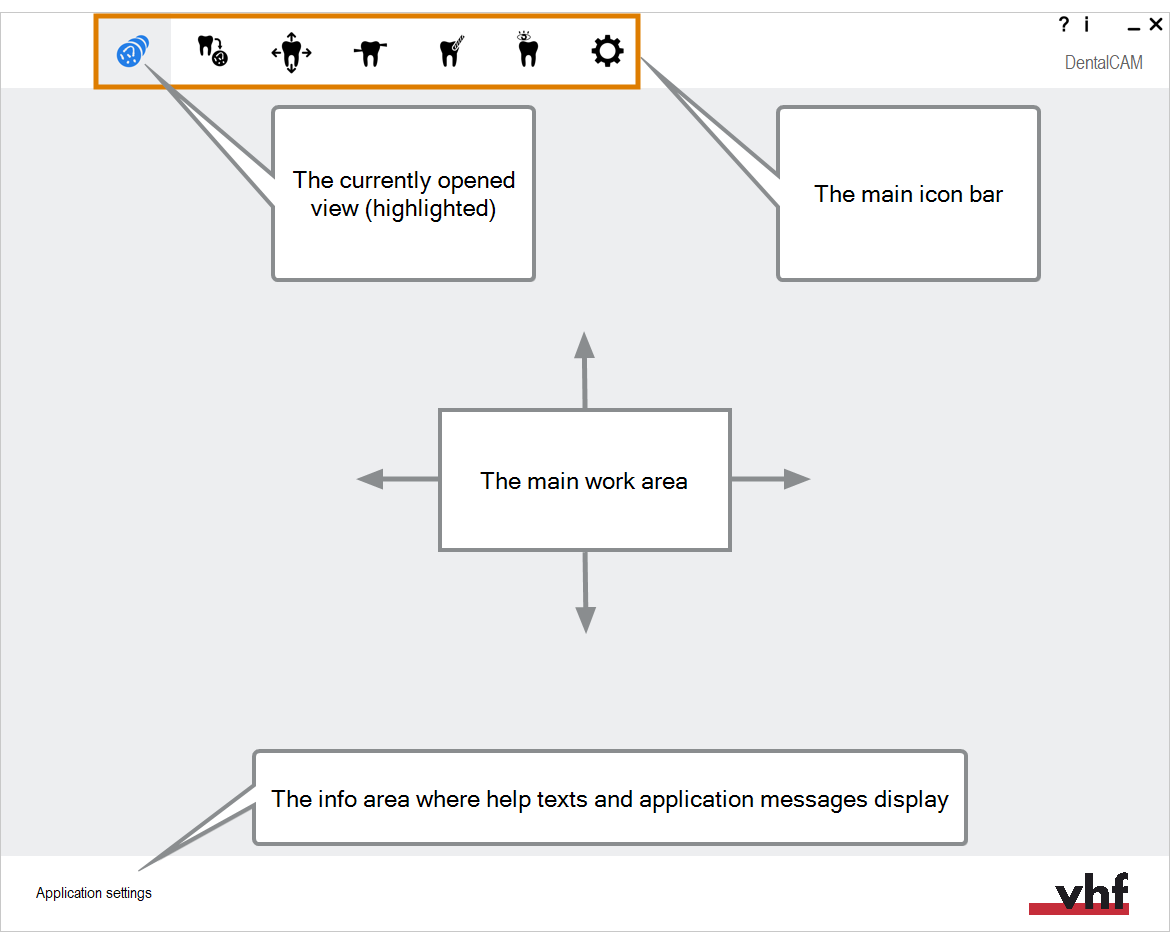
Before you start working with the applications, it is a good idea to learn how their user interface works. Both applications use the same interface structure and control elements.
The main elements of the setup window
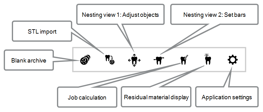
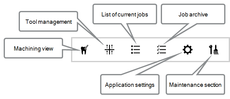
Highlighted and non-highlighted icons
A highlighted icon indicates that the corresponding machine function is activated or that the corresponding section in the software is open.
Right click on an icon to view a short description in the info area.
(a) The icon is not highlighted. (b) The icon is highlighted
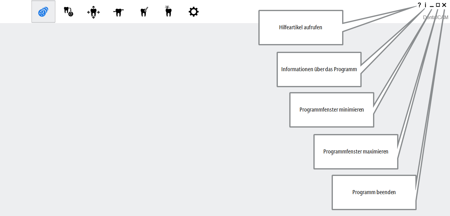
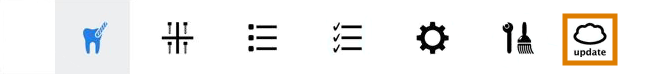
Update icon
If an update is available, the following icon displays in ’s main icon bar:
The update icon in DentalCNC‘s main icon bar (marked orange)
Updating DentalCAM and DentalCNC
Control elements of the user interface
Our manufacturing software Term for the software package consisting of DentalCAM and DentalCNC. uses standard Windows® control elements, however, we use stylized versions of them. The following table shows you the control elements used and tells you what they do:
| Control element | Description |
|---|---|
|
|
Drop-down lists When you click or tap on the arrow icon, a list opens. Select the desired entry from the list. If the available space is not sufficient to show all entries, use the scroll bar at the side of the list to display the remaining entries. |

|
Button By clicking or tapping on a button, you use a function or confirm an application message. If we refer to this text, we use square brackets [ ]. Example: Klicken Sie auf Weiter. |
|
|
Lists In a selection list, you mark the desired entry by clicking or tapping on it. If the available space is not sufficient to show all entries, use the scroll bar at the side of the list to display the remaining entries. The currently selected entry is highlighted. |
|
|
Input fields Click or tap on the desired field and type in the text. |
|
|
Toggle switches You can use toggle switches to select between 2 mutually exclusive options.
|
|
|
Options / Toggle switch groups Some toggle switches form a group from which you can only select one option at a time. In these cases, the currently activated option will be deactivated as soon as you activate a new option.
|
|
|
Value bars A value bar visualizes the corresponding value: The fuller the bar, the higher the value. Sometimes you can adjust the value by manipulating the value bar like this: Either click where you want the value bar to end, or drag the end of the value bar to where you want it. |