dentalcam's and dentalcnc's user interface
Before you start working with the applications, it is a good idea to learn how their user interface works. Both applications use the same interface structure and control elements. Let's take a look at a screenshot of dentalcam where all elements in the main working area have been hidden in order to better illustrate the basic user interface structure.
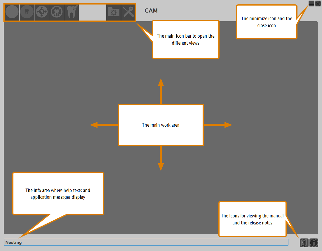
The main elements of the setup window
In the screenshot you can see the main elements of dentalcam's and dentalcnc's user interface:
- The icon bar at the top which is used to access the different sections
- The main area where the actual work is done
- The info area at the bottom where the applications display mainly help texts
 The icon bar of dentalcam
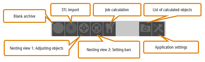
The icon bar in the CAM application
The icon bar of dentalcnc
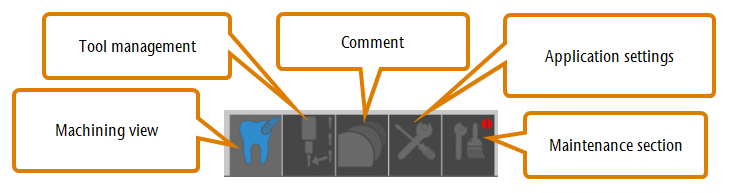
The icon bar in the CNC application
Confirming and canceling processes / dialogs
- To confirm a process or a dialog, click on the check mark icon:

- To cancel a process or dialog, click on the cross icon:

To keep texts short, we only describe how to complete processes. However, you often can also cancel processes as described.
Getting help, downloading updates and viewing release notes
With the icons in the bottom right corner of the application window, you can access these Help Articles, view the release notes and start the automatic update process:
The icons for updating, viewing Help Articles and release notes
The icon for automatic updates only displays in dentalcnc.
Control elements of the user interface
Our manufacturing software Term for the software package consisting of dentalcam and dentalcnc. uses standard Windows® control elements, however, we use stylized versions of them. Once you are familiar with their look, you should have no problems recognizing their functions. The following table shows you the control elements used and tells you what they do:
| Control element | Description |
|---|---|
|
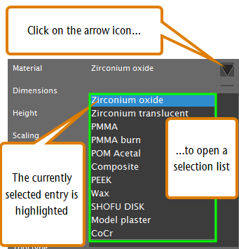
Drop-down lists When you click or tap on the arrow icon, a list opens. Select the desired entry from the list. If the available space is not sufficient to show all entries, use the scroll bar at the side of the list to display the remaining entries. |
  |
Icons By clicking or tapping on an icon, you use a function or confirm an application message. Some symbols have two states: A colorless state (see left example) and a highlighted state (see right example). If an icon is colorless, the corresponding function is currently deactivated. If an icon is highlighted, the corresponding function is currently activated. Right click on an icon to view a short description in the info area. |

|
Button By clicking or tapping on a button, you use a function or confirm an application message. In contrary to icons, buttons contain text instead of an image. If we refer to this text, we use square brackets [ ]. Example: Klicken Sie auf Weiter. |
|
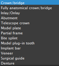
Selection lists In a selection list, you mark the desired entry by clicking or tapping on it. If the available space is not sufficient to show all entries, use the scroll bar at the side of the list to display the remaining entries. The currently selected entry is highlighted. |
|
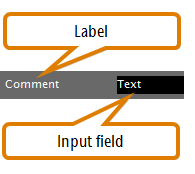
Input fields In an input field, you enter characters via your keyboard. Click or tap on the desired field and type in the text. |
 
|
Options By selecting a check box, you activate or deactivate the corresponding function. If the check box is empty (see upper left example), the function is deactivated. If the check box is filled (see upper right example), the function is activated. |
|
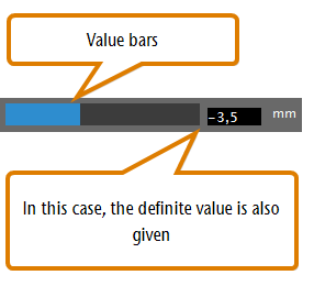
Value bars A value bar visualizes the corresponding value: The fuller the bar, the higher the value. The end of the bar shows the current value. Sometimes you can adjust the value by manipulating the value bar like this: Either click where you want the value bar to end, or drag the end of the value bar to where you want it. |